


Design Tips: How to Increase Your Booth's Stopping Power
|
|
Time to read 4 min


Link to your collections, sales and even external links
Add up to five columns


Our creative team will help you by designing a display solution that meets your functional requirements and fits your budget...
|
|
Time to read 4 min
A well-designed backwall can transform more compact 10x10 or 10x20 trade show booths into a bold, modern, and unforgettable trade show experience. It’s more than just a backdrop; it’s your brand’s first impression. Whether you're working with a standard pop-up, a backlit system or a modular Contour Hybrid display, this guide will walk you through how to design strategically for maximum impact, visibility, and engagement on the show floor.
When you're working with a booth template, it can be tempting to treat it like a giant canvas—filling every inch with content to show off everything you offer. But in a fast-paced trade show environment, more isn’t always better. Strategic layout is everything.
Most attendees will glance at your booth for just a few seconds. That means your design needs to quickly answer three questions:
Who are you? What do you do? Why should they care?
To capture attention, focus your message and visuals in the zones that matter most, especially at eye level.
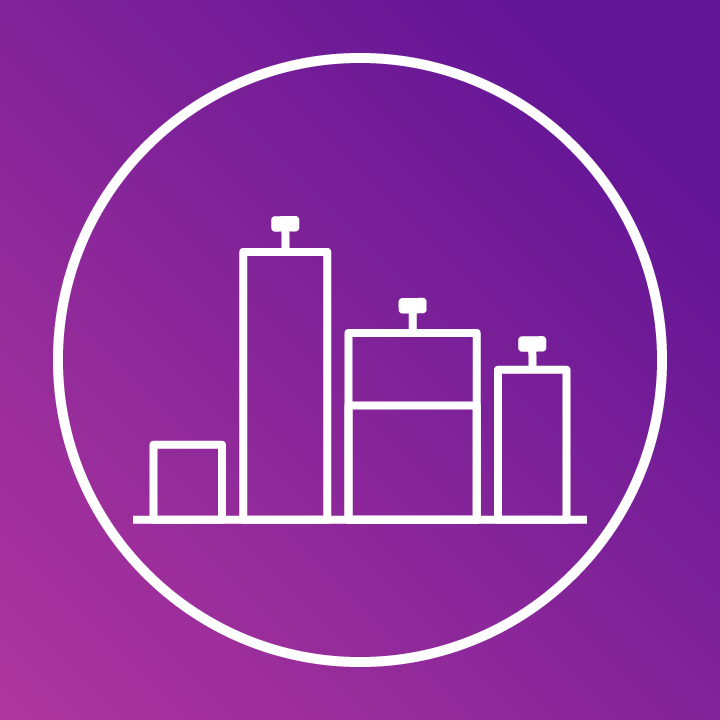
If we were to place a heatmap over your backwall, where would the most activity happen? Some areas naturally draw more attention than others. High-impact zones (around eye level) are where visitors pause, read, and engage. Lower sections, like the floor-level area, are often overlooked.
We created the Content Visibility Heatmap to help you visualize how people scan your booth. Use it to guide your layout, prioritize your messaging, and design with clarity and purpose. When you understand visual hierarchy, you can build a booth that breaks through the noise and gets results.
Use a vertical grid to structure your content strategically:
Zone |
Height (from floor) |
Purpose |
Header Area |
72"+ |
Great for logos, floating visuals, or brand graphics. This zone helps you stand out from a distance. |
Eye-Level Impact Zone |
48" – 72" |
This is your power zone. Place your logo, tagline, and bold headlines here. Focus on this area first. |
Kicker/Footer |
0" – 36" |
Use this space for URLs, social media handles, booth numbers, or non-critical info. Avoid putting actionable text here, as it's below waist level. |
Choosing the right font size is critical for making your message readable at trade shows. Booth visitors are often walking by from several feet away, and you only have a few seconds to capture their attention. Use this guide to ensure your messaging is visible, clear, and engaging.
Viewing Distance |
Minimum Size |
Recommended Size |
3–5 feet (close-up) |
20 pt |
30–36 pt |
6–10 feet (across aisle) |
40 pt |
60+ pt |
Pro Tip: If you’re unsure, err on the side of larger font sizes —especially for header messaging. It's better to oversize your headline than have it go unnoticed from across the aisle.
Resolution: Always design at 100–125 ppi at full size. Avoid enlarging web images—they’ll pixelate. Choose vector graphics or high-res photography.
Image Placement: Avoid placing faces, text, or products in the bottom 36”. Use images that direct focus inward (people looking toward your logo or CTA).
Backlit Design Tips: Stick to bold, saturated colours. Avoid gradients that fade to black. Confirm if your end panels are lit (many systems do not illuminate them).
For Xperience or Lucid backlit displays, choose high-contrast images and avoid shadows or black-heavy artwork . These can appear muddy when using an LED backlit graphic.
Corner vs Inline Placement:
If you’re not in a corner booth, avoid putting key messages or logos on the end panels—they may never be seen.
Use end panels for atmospheric visuals or wrap-around photography. A continuous image across the backwall and end panels can make your booth feel larger.
Lighting:
Backlit end panels must be tested before printing—if your system doesn’t light them, design with that in mind.
Use fades or solid colours to blend into unlit areas.
Podium Kits:
Consider making your podium an extension of your backwall. Carry over textures, colours, and key visuals.
Component Thinking:
Every piece of your booth (banners, podium, literature stand, flooring) should contribute to one unified experience.
Avoid Visual Clutter:
Don't try to say everything you do.
Use your booth to spark curiosity, not deliver an exhaustive pitch.
Use a QR code to drive visitors to a targeted landing page with the full story.
Message Hierarchy:
Focus on one clear value proposition. Then support it visually and structurally. Be bold, be focused, and be intentional.
Need support updating your display or graphics?
Our team can guide you through every step, from concept to print, to ensure your booth is seen and remembered. Prefer to supply your own artwork? We’ll flag any inconsistencies and notify you before printing to help avoid surprises so you can feel confident from start to finish.
Best Sellers for 10x10 and 10x20 Booth Spaces:
→ Xtension Pop-Up: Our most popular pop-up: lightweight, professional, and travel-friendly.
→ Xpressions Pop-Up: The easiest pop-up system to update and refresh for new shows.
→ Xperience Pop-Up: Illuminated, backlit design for maximum visibility and brand impact.
→ Virage Pop-Up: A curved pop-up with tool-free assembly and sleek presentation.
→ Contour: A customizable portable hybrid system that gives you a premium, modular look.


